CASE STUDY 1
Client
American Ramyeon Co.
Year
2025
Business Description
American Ramyeon Co. is a food service business that serves American-style ramyeon dishes. Ramyeon are Korean dry instant noodles that are similar to Japanese ramen noodles. Their dishes are inspired by different places and people in the U.S. The company hopes to build a full-service restaurant that includes a brick-and-mortar location, food trucks, and catering services.
Client Problem
American Ramyeon Co. is a new business that needed to build its brand identity from the ground up. This included creating a name, logo, and visual design that expressed their mission of providing their customers with the most delicious American-style ramyeon to satisfy any midnight craving. Additionally, we needed to think about how to communicate a new restaurant concept to potential customers when the restaurant is serving a new type of food with non-traditional ingredients and preparations.
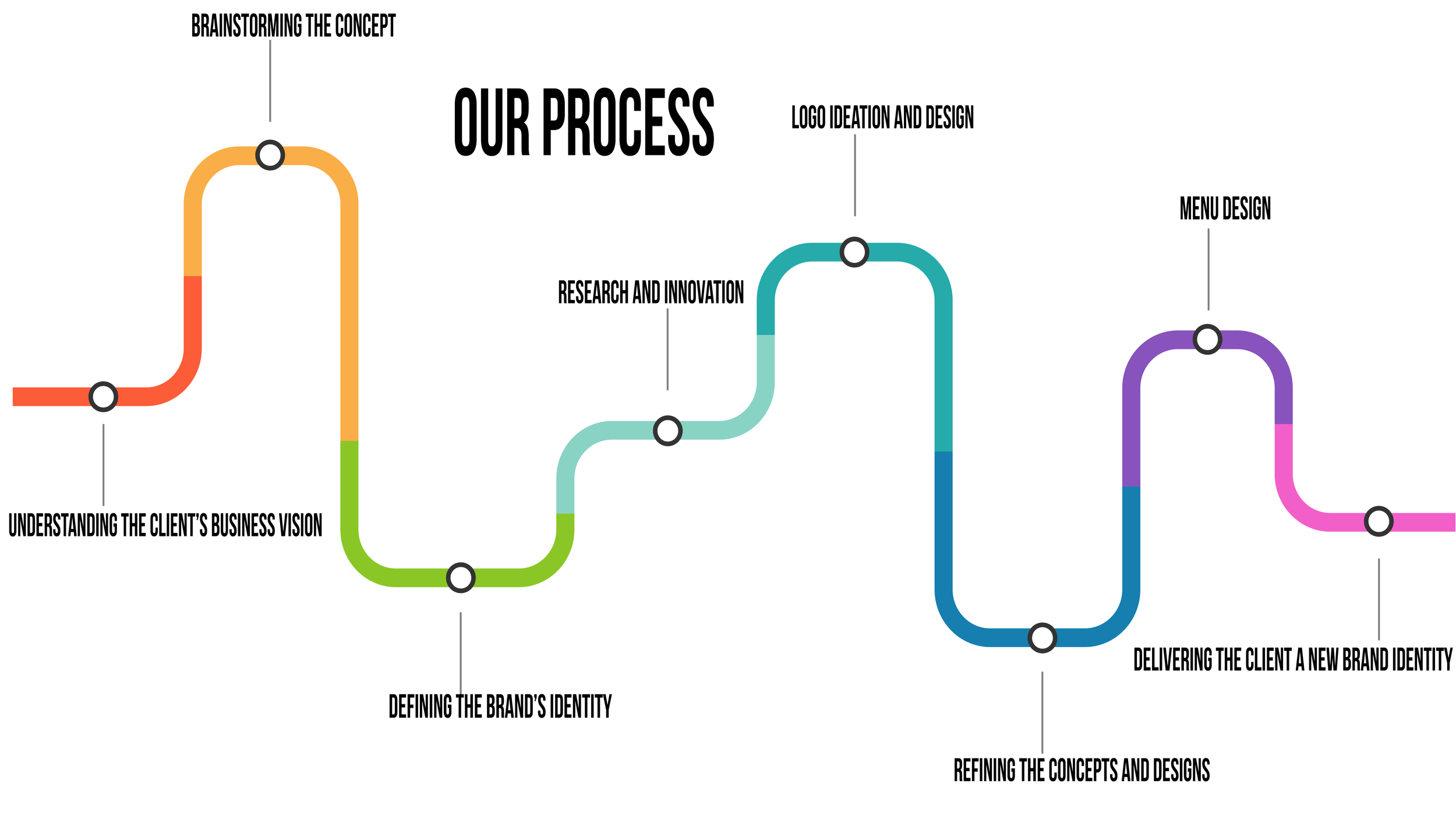
Our Solution
For American Ramyeon Co. we developed the restaurant’s concept, created a logo, and designed a menu.
Logo Creation
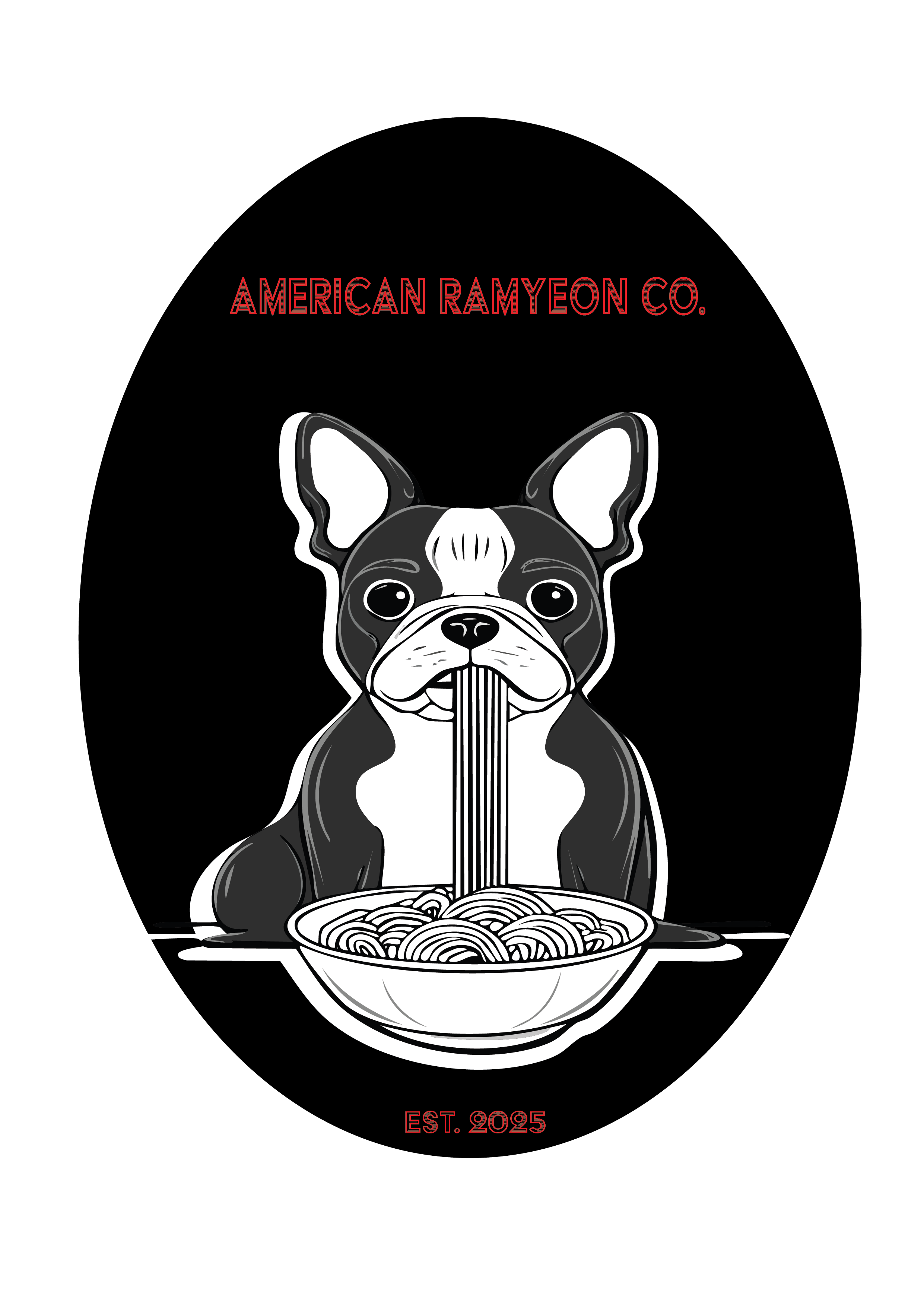
The client described their restaurant as a fast casual dining spot that would serve food that you can eat late at night when craving comfort food. The client who is partial to dogs described a logo that featured a cartoon version of a dog. The client also had an idea about how their food trucks would look stating that the truck should “our food truck would be covered in drawings in the American Traditional tattoo style (ramyeon, nori, chef knife, chopsticks, bbq/grill, food items - proteins and vegetables, etc.) and would also include traditional Korean art/tattoo themes.”
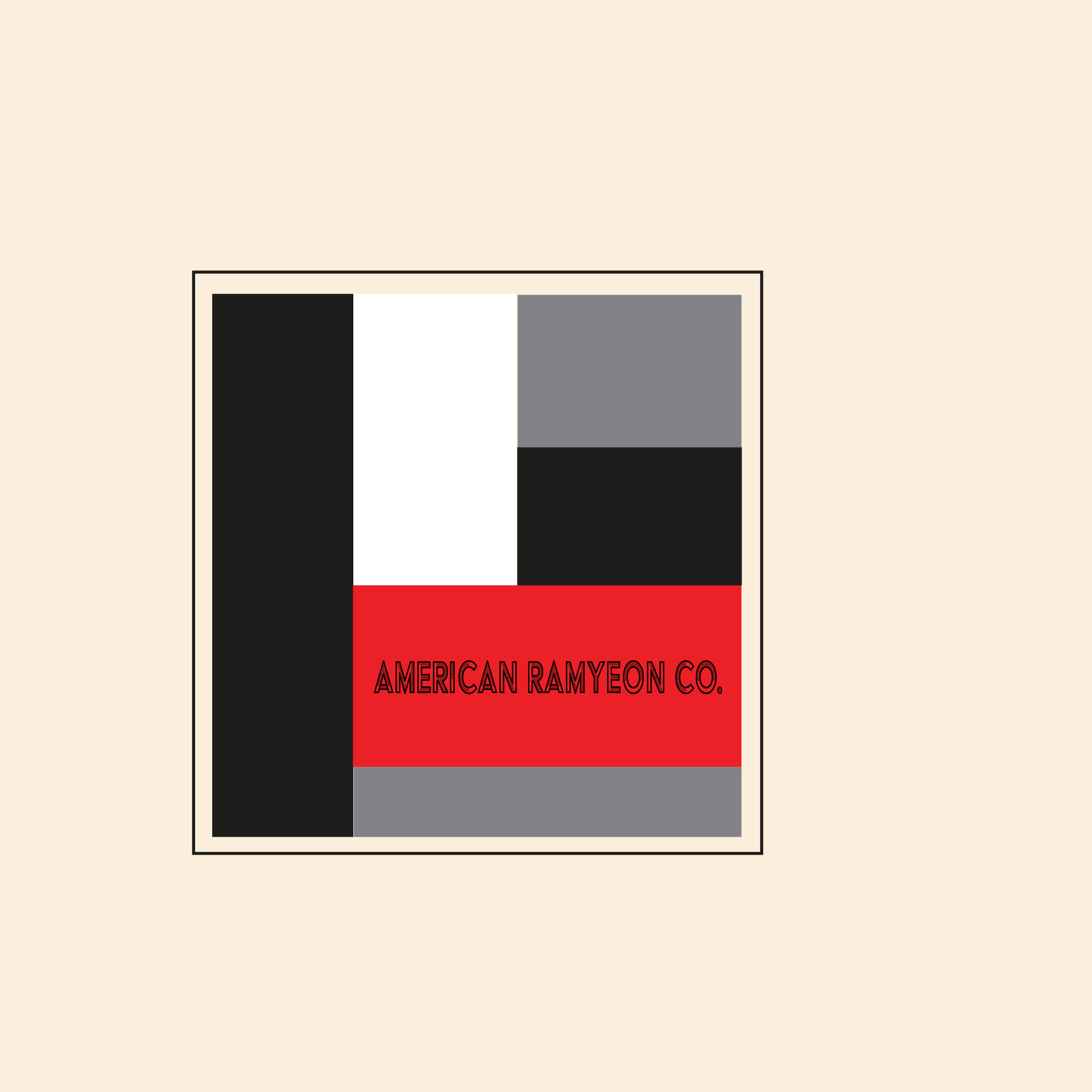
A logo quickly communicates who the brand is and must be recognizable. Because this is a restaurant the logo needed to simple and recognizable from a distance. For this logo we chose classic colors, Black, white with a pop of red to communicate that the restaurant is modern, cool, and is providing something new and interesting. We incorporated Boston terriers into the logo because they are a classic dog because they were developed in America in the late 19th century. Because the company is serving ramyeon American-style, the boston terrier was the best choice.
The choice of font for a company’s logo helps to communicate the company’s personality, values, and quality. A good logo can cause an emotional response. We chose Acier BAT Text Gris because it is a font that conveys a sense of modernity through its use of geometric shapes giving the type a sense of three-dimensionality.
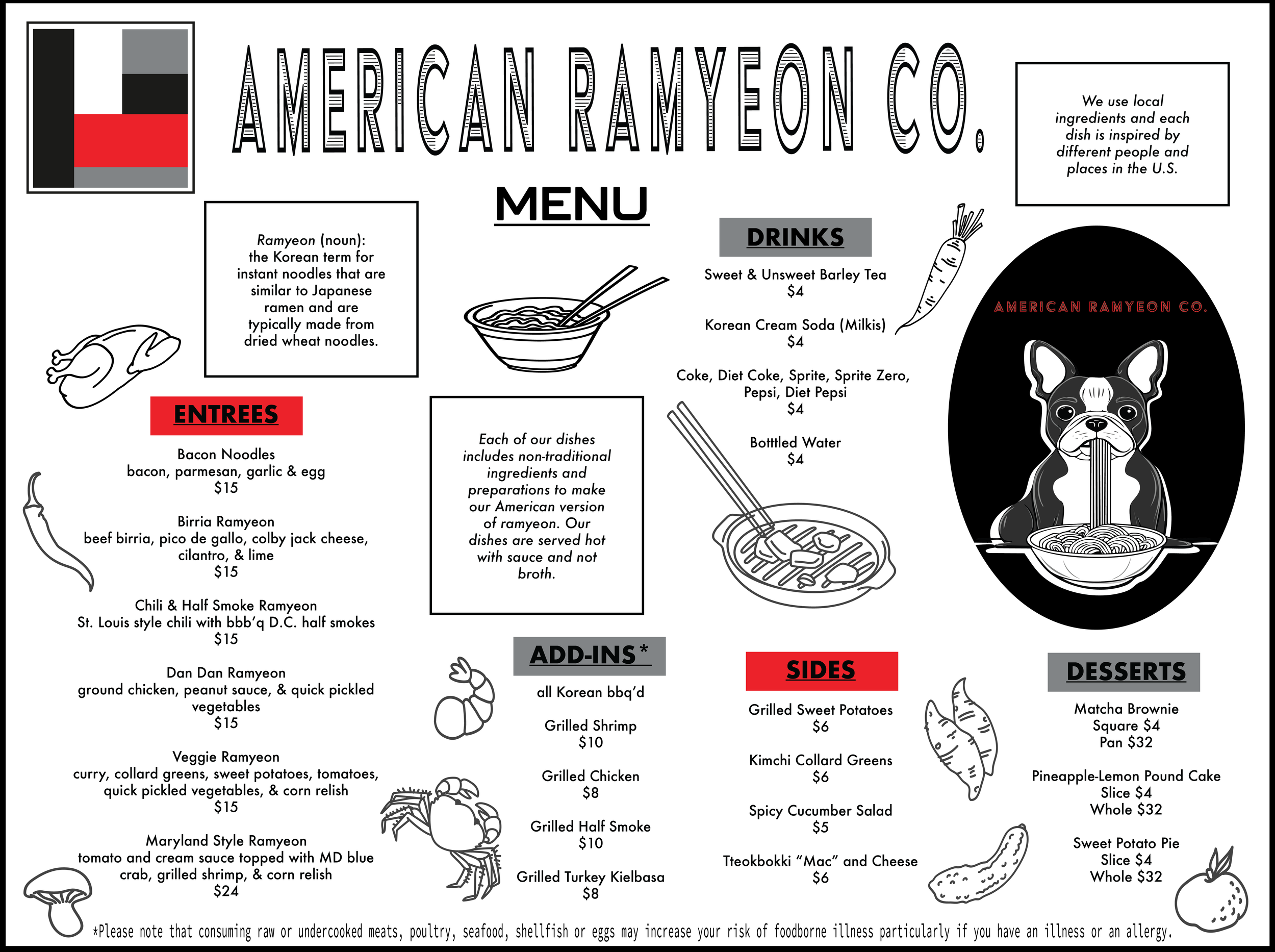
Menu Development and Design
We spoke with the client to get a sense of the type of food being served. The client stated that each dish was nontraditionally prepared and included nontraditional ingredients that reflected important people and places in the U.S. The restaurant is new so the menu is paired down and we decided to reflect that simplicity in the layout of the menu. We used geometric shapes with a simple color pattern that reflected the colors in the logo. We wanted the menu to be legible, visually clear, appetizing by adding drawings of the food ingredients.